Modern homes increasingly reflect a desire for calm, balance, and longevity rather than constant visual stimulation. This shift explains why neutral color decor ideas continue to dominate contemporary interior design conversations. Neutral interiors do not rely on trend driven colours that fade quickly. Instead, they create adaptable spaces that evolve with lifestyle changes, seasonal updates, and personal taste.
Contrary to the outdated belief that neutral homes feel bland or unfinished, modern design shows that neutrals can be expressive, layered, and deeply inviting. When applied thoughtfully, they enhance architectural features, support natural light, and allow furniture and textures to shine. Designers today use neutral palettes not as a limitation, but as a framework for timeless living.
This article examines the role of neutrals in contemporary interiors, strategies for incorporating them to create a warm and dynamic space, and common design pitfalls to avoid. Each section draws on established interior design research and principles supported by academic and architectural sources, ensuring accuracy and trust throughout.
Why neutral palettes suit modern living
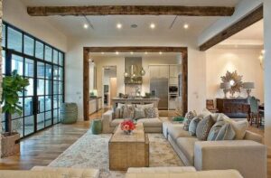
Neutral colours work especially well in modern homes because they align with clean layouts, open floor plans, and functional design. Shades like beige, taupe, soft grey, greige, ivory, and warm white reduce visual noise. This makes spaces feel larger, calmer, and more cohesive.
Research from architectural psychology studies published by the American Institute of Architects shows that neutral interiors support mental clarity and reduce sensory overload. In practical terms, this means neutral spaces feel easier to live in over long periods.
Another advantage lies in adaptability. Modern homes often serve multiple purposes, including work, relaxation, and social interaction. Neutrals create a consistent backdrop that supports all these functions without demanding constant updates.
Understanding undertones before choosing neutrals
The success of neutral interiors depends heavily on undertones. Warm neutrals contain hints of yellow, red, or brown, while cool neutrals lean toward blue or green. Mixing undertones without intention often leads to flat or mismatched spaces.
Interior colour theory research from the Royal Institute of British Architects emphasizes that undertones influence perceived temperature and emotional response. Warm neutrals tend to feel more welcoming, while cool neutrals feel structured and contemporary.
Before committing to paint or furniture, observe how natural light moves through the space during the day. Morning light enhances warm tones, while northern or shaded rooms benefit from warmer neutrals to avoid feeling stark.
Neutral accents for warm interiors that feel lived in
Many homeowners worry that neutral homes will feel cold or impersonal. This concern usually stems from a lack of warmth at the accent level. Neutral accents for warm interiors solve this issue without introducing bold colours that disrupt cohesion.
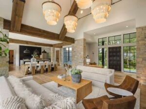
Natural materials such as wood, linen, wool, leather, and stone add warmth while remaining within a neutral spectrum. According to material studies from the International Journal of Interior Architecture, tactile surfaces significantly influence comfort perception even when colour variation remains subtle.
Layered textiles, handcrafted ceramics, and matte finishes also help soften modern lines. The key is variation in texture rather than colour saturation. Warmth emerges from depth, not decoration overload.
Repeating neutral accents for warm interiors in small doses across rooms creates flow. A wood tone introduced in the living room can reappear subtly in shelving or lighting elsewhere, reinforcing visual continuity.
Modern neutral walls and furniture as a foundation
Walls and large furniture pieces set the emotional tone of a home. Modern neutral walls and furniture provide a stable foundation that supports both minimalist and layered aesthetics.

Warm white and soft greige walls reflect light evenly without glare. Studies from the Lighting Research Center at Rensselaer Polytechnic Institute show that light reflective neutrals improve visual comfort more effectively than pure white surfaces.
Furniture in neutral upholstery allows form and proportion to take centre stage. Sofas, beds, and dining chairs in stone, sand, or mushroom tones age better visually and adapt easily to new accessories.
When selecting modern neutral walls and furniture, consistency matters more than uniformity. Subtle variation within the same tonal family creates richness without visual chaos.
How to add contrast in neutral spaces without overpowering them
Contrast prevents neutral interiors from feeling flat, but it must be controlled. Knowing how to add contrast in neutral spaces is one of the most valuable design skills for modern homes.
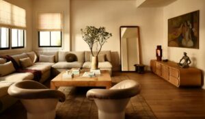
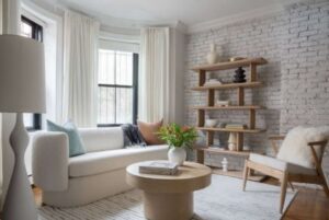
Contrast does not require black walls or dramatic colour blocks. It can appear through shadow, scale, texture, and material shifts. Dark wood, charcoal metal accents, or stone surfaces introduce depth while staying within a neutral palette.
Design theory published by the Journal of Environmental Psychology highlights that moderate contrast improves spatial clarity and visual interest. Excessive contrast, however, increases cognitive load and disrupts calm environments.
Effective ways to repeat how to add contrast in neutral spaces include varying finishes, such as pairing matte walls with subtle sheen fabrics or smooth stone with raw wood. These choices maintain balance while keeping spaces visually engaging.
Neutral decor tips for contemporary spaces with open layouts
Open plan homes benefit greatly from neutral palettes, but they also present challenges. Without walls to separate areas, visual flow becomes essential. Neutral decor tips for contemporary spaces focus on zoning without disruption.
Area rugs, ceiling treatments, and furniture arrangement help define zones while keeping colour consistent. Research from the Urban Land Institute suggests that visual continuity improves perceived spaciousness in open layouts.
Subtle tonal shifts between rooms create gentle transitions. A slightly warmer neutral in the dining area can differentiate it from the living space without breaking harmony.
Applying neutral decor tips for contemporary spaces also means resisting over decoration. Negative space plays a crucial role in modern design, allowing architecture and light to breathe.
The role of lighting in neutral interiors
Lighting is a key factor in neutral color decor ideas as it determines whether neutral interiors feel warm or lifeless. Natural light should always guide colour selection, but artificial lighting completes the experience.
Warm temperature lighting enhances beige, taupe, and cream tones, while cooler lighting supports grey based neutrals. According to the Illuminating Engineering Society, residential lighting between 2700K and 3000K best supports comfort in neutral environments.
Layered lighting adds dimension. Ambient, task, and accent lighting work together to create depth and flexibility. This approach ensures neutral spaces adapt easily from day to night.
Common mistakes that undermine neutral interiors
One common mistake is relying on a single neutral tone everywhere. This flattens the space and removes visual interest. Successful neutral homes use variation within limits.
Another issue involves ignoring material quality. Neutrals highlight flaws more than bold colours. Poor finishes, uneven textures, or low quality materials become obvious.
Finally, avoiding contrast entirely leads to sterile results. Understanding how to add contrast in neutral spaces prevents this by introducing controlled visual anchors.
Sustainability and longevity of neutral design
Neutral interiors align closely with sustainable design principles. Timeless palettes reduce renovation frequency and material waste. Academic studies from the University of Cambridge on sustainable architecture confirm that adaptable interiors contribute to longer building life cycles.
Also Read: Smart storage ideas for small homes to organise every room
Neutral foundations also support reuse. Furniture, decor, and materials transition easily between homes or room functions, reducing consumption.
This sustainability aspect strengthens the long term value of neutral color decor ideas, especially for homeowners focused on responsible living.
Conclusion
Neutral interiors succeed not because they avoid colour, but because they use restraint intelligently. When applied with intention, neutral color decor ideas create homes that feel calm, warm, and adaptable to modern life.
By layering texture, choosing thoughtful materials, and understanding neutral accents for modern interiors, homeowners avoid sterile results. Strategic use of neutral colors on walls and furniture establishes a strong foundation, while knowing how to add contrast to neutral spaces keeps interiors visually engaging.
Most importantly, applying proven neutral decor tips for modern spaces ensures that neutral homes feel lived in, personal, and enduring. In a world driven by constant change, neutral design offers something increasingly rare. A sense of balance that lasts.
Frequently asked questions
1. Are neutral interiors suitable for homes with children or pets
Neutral interiors are highly suitable for family homes when planned with durability and warmth in mind. Using neutral accents for warm interiors, such as textured fabrics, wood finishes, and layered rugs, helps hide everyday wear while maintaining a calm aesthetic. Studies in environmental design show that balanced colour palettes reduce visual stress, which benefits children in active spaces. Mid tone neutrals work better than stark white, especially in high traffic areas. With washable materials and thoughtful contrast, neutral homes remain practical, welcoming, and resilient for households with children or pets.
2. How do neutral interiors affect mood and mental wellbeing
Neutral environments support emotional balance by reducing visual overstimulation. Research in environmental psychology links soft, cohesive palettes with improved focus, relaxation, and cognitive comfort. Neutral decor tips for contemporary spaces often prioritise light, texture, and tonal consistency rather than bold contrasts, which helps the mind rest. Unlike highly saturated colours, neutrals adapt to changing moods instead of dictating them. This makes them ideal for bedrooms, living rooms, and home offices where long term comfort matters more than short term visual impact.
3. Can neutral homes still reflect personality and personal style
A neutral base enhances personal expression rather than limiting it. Design research from architectural institutes shows that individuality becomes more visible when the background remains calm. Modern neutral walls and furniture act as a foundation that allows artwork, handmade decor, cultural objects, and meaningful textures to stand out naturally. Personality also appears through lighting choices, spatial layout, and material selection. Instead of relying on colour alone, neutral interiors tell a layered story that evolves with life changes while maintaining visual harmony.
4. What is the difference between warm neutrals and cool neutrals
Warm neutrals contain subtle undertones of beige, brown, or soft yellow, while cool neutrals lean toward grey, blue, or green. Colour perception studies show that warm tones feel more inviting and are better suited for living spaces, especially in homes with limited natural light. Cool neutrals appear crisp and modern but can feel flat if not balanced. Choosing the right undertone supports neutral accents for warm interiors and prevents spaces from feeling cold or disconnected, particularly in modern open layouts.
5. How can renters apply neutral decor without permanent changes
Neutral design is ideal for rental homes because it relies on flexible elements rather than structural changes. Neutral decor tips for contemporary spaces emphasise removable layers such as rugs, lighting, curtains, and furniture to create cohesion without altering walls. Research on adaptable interiors shows that movable design elements offer the greatest long term value. Neutral palettes help unify mismatched finishes commonly found in rentals, while allowing renters to personalise their space and carry those pieces into future homes.
6. Do neutral interiors work well in small homes or apartments
Neutral interiors often perform better in smaller homes than bold colour schemes. Visual perception research confirms that light reflective surfaces and cohesive tones make spaces feel larger and more open. Modern neutral walls and furniture reduce visual clutter and create continuity between rooms. Texture, material variation, and subtle contrast add depth without overwhelming the space. This approach improves functionality while maintaining warmth, making neutral design especially effective for apartments and compact homes.
7. How do neutral interiors support long term sustainability
Neutral interiors align closely with sustainable design principles by promoting longevity and adaptability. Academic research on building life cycles shows that timeless palettes reduce frequent renovations and material waste. How to add contrast in neutral spaces without relying on trends allows homeowners to refresh interiors without replacing major elements. Neutral foundations support reuse, furniture longevity, and evolving lifestyles. Over time, this approach reduces consumption while maintaining visual relevance and comfort.