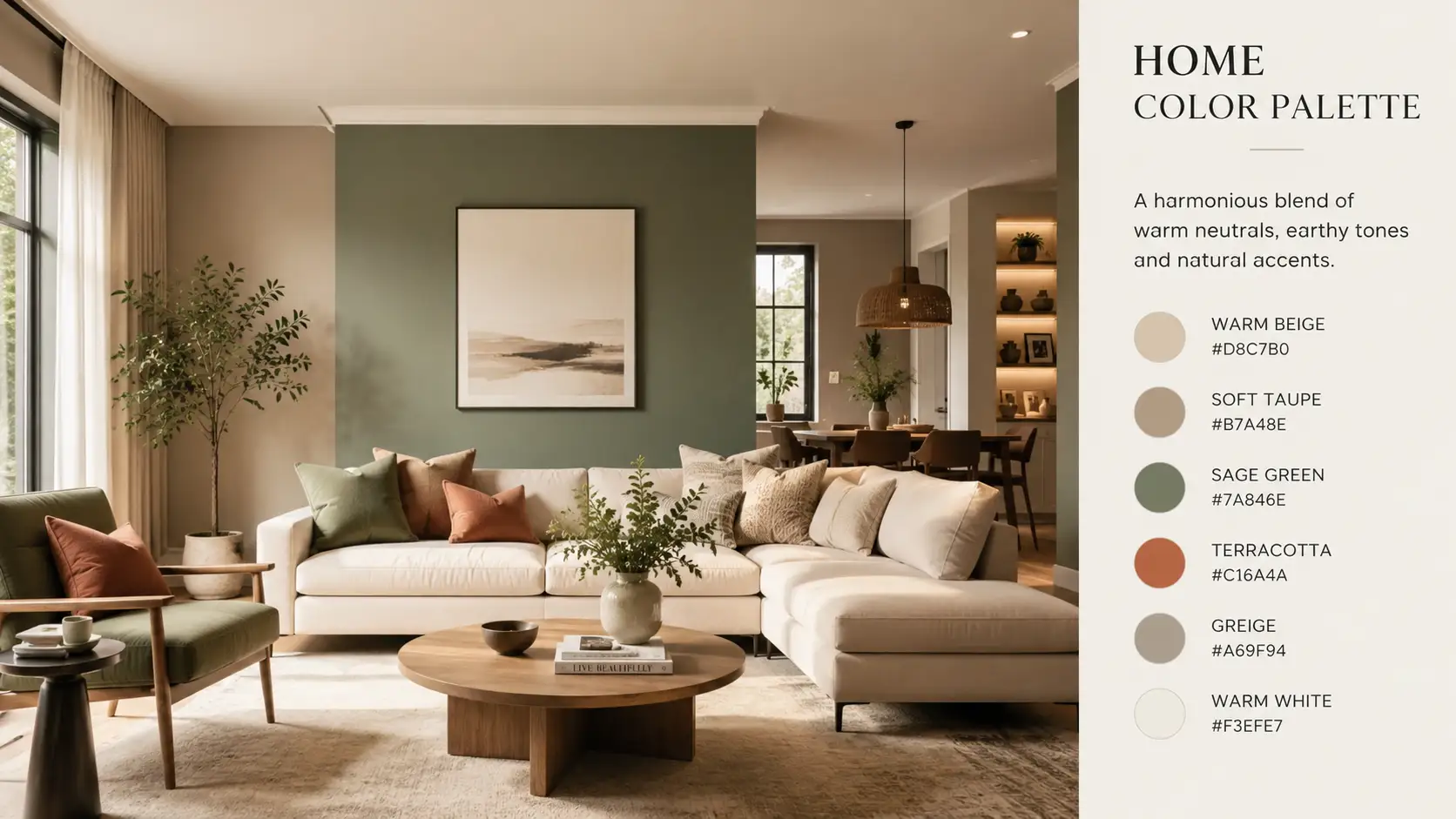
Creating a beautiful home is not only about buying expensive furniture or following the latest interior trends. The colours used across different rooms play a major role in shaping the atmosphere, comfort, and visual flow of a home. A carefully selected home color palette helps every room feel connected while still allowing each space to have its own personality.
Many homeowners struggle with mismatched wall shades, furniture colours that clash, or rooms that feel disconnected from one another. This usually happens when colours are chosen separately without considering the overall interior design flow. Understanding how colours interact can help create a space that feels balanced, welcoming, and visually organised.
Interior designers often use colour psychology, lighting analysis, and proportion techniques to create harmony inside homes. According to the National Endowment for the Arts and colour studies published by universities such as Stanford University, colour choices influence mood, perception of space, and emotional comfort. These factors make colour planning one of the most important steps in home decoration.
This guide explains practical strategies, expert backed methods, and easy design principles that help homeowners confidently choose colours that work beautifully together while learning how to create a balanced interior color flow throughout the home.
Why colour harmony matters in interior design
Colour harmony creates visual consistency. When colours complement one another naturally, a home feels calm, organised, and intentional. Without harmony, even expensive interiors can appear chaotic or unfinished.
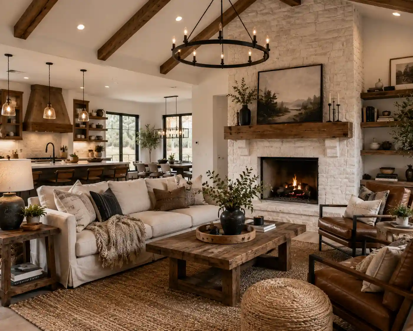
A cohesive home color scheme improves the transition between rooms. This is especially important in open floor plans where living rooms, kitchens, and dining spaces are visually connected. Using related tones creates continuity without making the home feel repetitive.
Studies discussed by the University of Minnesota Extension show that warm colours such as soft terracotta or muted yellow can create a welcoming feeling, while cooler shades like sage green or dusty blue encourage calmness and relaxation. This emotional effect explains why colour planning matters beyond aesthetics.
Good interior colour harmony also helps with resale value. Real estate reports from informational housing studies consistently show that neutral and coordinated interiors appeal to a wider range of buyers because the spaces feel larger and easier to personalise.
Understanding the basics of colour theory
Before learning how to select paint colours for your home, it helps to understand a few core colour principles. Colour theory explains how different shades interact with one another.
Primary, secondary, and tertiary colours
Primary colours include red, blue, and yellow. Secondary colours are created by mixing primary colours, such as green, orange, and purple. Tertiary colours combine primary and secondary shades for more nuanced tones.
Most modern interiors use softened or muted tertiary shades because they feel more sophisticated and adaptable.
Warm and cool tones
Understanding warm and cool tones is essential when selecting paint colours because these shades influence emotional comfort and visual temperature inside a room. Warm colours include reds, oranges, and yellows. These colours create energy and warmth. Cool colours such as blues, greens, and greys create a more peaceful atmosphere.
Balancing warm and cool tones properly is essential for achieving comfort throughout the home.
Undertones matter more than most people realise
Paint colours often contain hidden undertones. A beige paint may include pink, yellow, or green undertones. These paint undertones affect how colours appear under different lighting conditions.
Ignoring undertones is one of the most common mistakes people make during interior paint selection.
Start with the room that matters most
One of the easiest ways to build a coordinated home colour palette is to begin with the room used most frequently. For many households, this is usually the living room or kitchen.
Choosing a foundational room helps establish the overall design direction. From there, related colours can flow naturally into nearby spaces while improving overall wall colour coordination.
Interior designers often recommend selecting three main tones:
Dominant colour
This is the primary wall colour or largest visible shade in the room.
Secondary colour
This colour supports the dominant shade and often appears in furniture, curtains, or rugs.
Accent colour
Accent colours add personality through cushions, artwork, or decorative objects. Thoughtful accent colour ideas can make interiors feel stylish without overwhelming the overall design.
Using this layered method helps maintain visual balance while preventing monotony.
Evaluate natural and artificial lighting carefully
Lighting changes colour dramatically. A paint shade that looks soft beige in a showroom may appear grey or yellow inside a home.
North facing rooms generally receive cooler light, making colours appear darker. South facing rooms receive warmer sunlight that enhances warm tones.
Artificial lighting also impacts appearance:
Warm white lighting
Creates cosy and inviting spaces.
Cool white lighting
Makes colours appear sharper and more modern.
Daylight bulbs
Provide the closest representation to natural light.
Understanding the relationship between lighting and paint colours is one of the smartest ways to avoid costly repainting mistakes.
How to choose paint colors for your home using the 60 30 10 rule
Professional designers frequently use the 60 30 10 rule to create balanced interiors. This approach simplifies colour distribution and improves room colour balance.
60 percent dominant colour
This usually covers walls and large furniture pieces.
30 percent secondary colour
Often used in upholstery, curtains, or area rugs.
10 percent accent colour
Used sparingly for visual interest.
This method prevents rooms from feeling visually overwhelming while still allowing creativity.
When homeowners ask experts how to choose paint colors for your home, this rule is often the first recommendation because it works in nearly every design style.
Create flow between rooms without making them identical
Many people think a seamless home colour combination means every room must use the exact same paint colour. That approach can make a home feel flat and repetitive.
Instead, designers recommend using connected tones that share similar undertones.
For example:
A warm greige living room may transition into a muted sage dining room and then into a creamy beige hallway. These colours differ slightly while still feeling connected.
Using repeated accent colours throughout the home also improves consistency. A navy blue accent pillow in the living room can connect beautifully with navy artwork in the bedroom.
This strategy is especially useful for open concept home colours because connected spaces need visual continuity without appearing overly uniform.
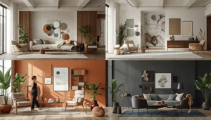
The best color combinations for home interiors
Some colour combinations remain timeless because they naturally create balance and elegance.
Soft white and warm beige
This pairing creates brightness while maintaining warmth and comfort through the use of neutral paint shades.
Sage green and natural wood
A popular combination inspired by nature. It works especially well in earth tone interiors and homes designed with a natural colour palette.
Navy blue and light grey
Creates sophistication and depth without feeling too dark.
Terracotta and cream
Offers warmth and Mediterranean inspired charm.
Charcoal and muted blush
Adds modern contrast while keeping spaces soft and welcoming.
The best color combinations for home interiors usually include a balance of light, medium, and dark tones. This contrast prevents rooms from feeling visually flat.
Use inspiration wisely without copying trends blindly
Social media platforms showcase endless home inspiration photos. While inspiration is useful, blindly copying trends often leads to regret.
Trendy colours change quickly. A better strategy involves choosing timeless base colours and incorporating trends through smaller decorative elements.
For example:
Instead of painting an entire room bright olive green because it is trending, homeowners can use olive green cushions, throws, or artwork while keeping walls neutral.
This approach supports timeless home décor while making future updates easier and more affordable.
Pay attention to flooring and fixed elements
Many homeowners select wall colours first and then realise the shades clash with flooring, countertops, or cabinets.
Fixed elements should always guide colour decisions.
Wood flooring
Warm wood floors pair better with warm neutrals.
Grey flooring
Cool toned floors usually work best with cool greys or muted shades.
Stone countertops
Natural stone often contains multiple undertones that should be matched carefully.
Taking photographs and comparing paint samples directly beside these materials can prevent expensive mismatches and improve overall home decorating ideas.
Why texture is just as important as colour
Texture affects how colour appears inside a room. Matte finishes absorb light, while glossy finishes reflect it.
Different materials also influence colour perception:
Linen softens colour intensity
Velvet deepens richness
Wood adds warmth
Metal introduces contrast
Layering textures helps interiors feel more dynamic and visually comfortable, especially in minimalist home décor where subtle details carry greater visual importance.
Build a home color palette around emotional goals
Colour selection should support how each room is meant to feel.
Bedrooms
Soft blues, sage greens, and warm neutrals encourage relaxation while offering excellent bedroom paint inspiration for calming spaces.
Home offices
Muted greens and earthy tones may improve focus and concentration.
Kitchens
Warm whites and natural tones create an inviting atmosphere.
Bathrooms
Cool tones often create a spa like effect.
The emotional purpose of each room should guide colour choices rather than trends alone. This is where colour psychology in interiors becomes highly valuable for homeowners and designers alike.
Common mistakes homeowners should avoid
Choosing paint before furniture
Large furniture pieces are more difficult and expensive to replace than paint.
Ignoring undertones
Undertones can completely change how colours interact.
Using too many bold colours
Too many competing colours create visual chaos.
Forgetting transitions between rooms
Abrupt colour changes disrupt visual flow.
Skipping sample testing
Paint colours almost always look different on walls than on tiny swatches.
Avoiding these mistakes significantly improves the final result.
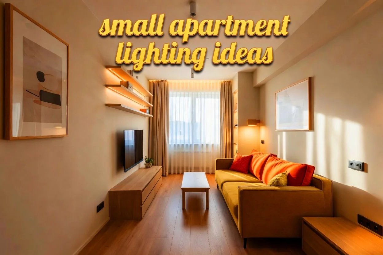
Using a cohesive home color scheme in small spaces
Small homes and apartments benefit greatly from thoughtful colour coordination.
Lighter shades help reflect light and make spaces appear larger. Repeating similar tones across connected areas reduces visual interruptions and creates openness.
Mirrors, reflective surfaces, and layered lighting can further enhance spaciousness.
Even in compact homes, variation is still important. Accent colours and textures prevent rooms from feeling sterile or overly plain. Many modern interior design experts recommend softer tones and multifunctional décor for compact living environments.
The psychology behind colour choices
Colour psychology has been studied for decades in design and behavioural research.
Blue tones are often associated with calmness and trust
Green shades connect to nature and balance
Yellow adds energy and warmth
Neutral colours provide flexibility and comfort
Dark colours create intimacy and sophistication
While emotional responses to colour can vary culturally and personally, these general associations often influence interior design decisions worldwide.
Sustainable and timeless colour planning
Sustainability now plays a larger role in interior design choices. Constantly repainting rooms due to trend changes increases waste and expenses.
Timeless colour palettes reduce the need for frequent updates.
Neutral foundations combined with interchangeable accents create long lasting flexibility. This approach supports both financial and environmental sustainability.
Low VOC paints also improve indoor air quality and reduce chemical emissions, according to the United States Environmental Protection Agency.
Many homeowners searching for timeless paint palette ideas for modern homes now prioritise sustainability alongside style and durability.
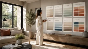
Testing your home color palette before committing
Professional designers rarely choose colours without testing samples first.
Paint large sample sections
Small swatches can be misleading.
Observe colours during morning and evening
Lighting changes throughout the day.
Compare against furniture and flooring
This ensures harmony with existing materials.
Test multiple finishes
Matte, eggshell, and satin finishes affect colour perception differently.
Testing samples is particularly important when planning living room colour ideas because communal spaces experience changing light conditions throughout the day.
Final thoughts on creating a balanced and inviting home
A thoughtfully planned home color palette transforms a house into a connected and welcoming environment. Colours influence comfort, mood, lighting perception, and the overall experience of a space. Instead of chasing fast changing design trends, homeowners benefit more from choosing shades that reflect their lifestyle, lighting conditions, and emotional goals.
Also Read: Eco friendly storage solutions that actually work in modern homes
Understanding how to pick the right paint colours for your house requires patience, observation, and attention to detail. Undertones, lighting, textures, and room transitions all play an important role in creating harmony. By focusing on balance and intentional design choices, homeowners can build a well matched interior colour palette that feels timeless, functional, and visually calming.
The top interior colour combinations for homes are rarely the loudest or trendiest options. They are usually the combinations that create comfort, consistency, and long term satisfaction across every room in the home.
Sources
- National Endowment for the Arts
- Stanford University colour psychology references
- University of Minnesota Extension
- United States Environmental Protection Agency
FAQs
What is the easiest way to create a cohesive home color scheme?
The easiest way to build a connected home atmosphere is to start with one foundational colour and repeat related shades throughout nearby spaces. Many designers recommend beginning with shared undertones because they naturally improve visual continuity between rooms. Soft neutrals, earthy shades, and layered textures often work well together because they create flexibility without making interiors feel repetitive. Homeowners should also pay attention to flooring, furniture fabrics, and natural light because these elements influence how colours appear across different areas of the home.
Why do paint colours look different in every room?
Paint colours change depending on the direction of sunlight, the amount of natural brightness, artificial lighting, and nearby surfaces. A colour that appears creamy during the morning may look dull or grey in the evening. Reflective materials such as mirrors, glossy flooring, and metallic décor can also affect colour perception. Testing large paint samples on different walls allows homeowners to understand how shades react throughout the day. This process reduces the risk of choosing colours that feel completely different after full application.
Are neutral tones better for modern interior design?
Neutral shades remain highly popular because they create flexibility and timeless appeal. Colours such as warm white, greige, soft beige, and muted taupe can support many decorating styles without becoming outdated quickly. However, neutral interiors should still include layered textures, contrasting materials, and subtle accent details to avoid looking flat. Designers often combine neutral walls with natural wood, linen fabrics, and carefully selected décor pieces to create warmth and personality while maintaining a clean and sophisticated appearance.
How do undertones affect interior paint choices?
Undertones are hidden background colours inside paint that become visible under certain lighting conditions. For example, a grey paint may contain blue, green, or purple undertones that influence how it appears on walls. Understanding undertones is one of the most overlooked parts of learning how to choose paint colors for your home because even small undertone differences can affect the overall mood of a space. If undertones clash with flooring, furniture, or cabinets, the room may feel visually uncomfortable even when the main colour appears correct. Matching undertones carefully helps create better harmony across the entire interior.
What are timeless interior colour combinations?
Best color combinations for home interiors usually include balanced contrasts and natural looking tones that remain visually appealing for many years. Popular examples include warm white with beige, navy with light grey, sage green with natural wood, and cream paired with terracotta accents. These combinations feel elegant because they create both softness and visual depth without relying on short lived trends. Designers often recommend building interiors around flexible foundational colours and introducing personality through textiles, artwork, and decorative accents instead of dramatic wall colours.
Can dark colours work in small rooms?
Dark colours can work beautifully in smaller spaces when used thoughtfully. Deep shades such as charcoal, forest green, navy blue, or rich brown can create intimacy and sophistication rather than making rooms feel cramped. Proper lighting is extremely important because poorly lit dark rooms may appear heavy or enclosed. Combining dark walls with mirrors, layered lighting, lighter furniture, and reflective surfaces helps maintain visual balance. Many designers also recommend limiting clutter because darker colours tend to highlight overcrowded spaces more easily.
Why is texture important in interior colour planning?
Texture changes the way colours interact with light and affects how comfortable a room feels visually. Matte fabrics soften colour intensity, glossy finishes reflect brightness, and natural materials such as wood or stone introduce warmth and variation. Even when a room uses a simple colour palette, layered textures can create richness and depth that prevent the space from feeling plain. Designers often combine multiple materials including linen, velvet, woven rugs, ceramics, and wood surfaces to make interiors feel more balanced and visually inviting.